CPTnet
9 July 2013
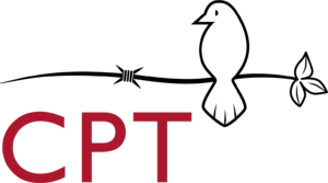
CPT INTERNATIONAL: Christian Peacemaker
Teams launches new logo
Flowing from a three-and-a-half year Mission and
Presentation Re-visioning (MAPR) process that included representation from all
parts of Christian Peacemaker Teams, graphic artist Nekeisha Alexis-Baker
created a new logo for CPT.
The CPT visual identity, as Alexis-Baker articulates it,
“focuses on the organization’s new mission statement, ‘Building partnerships to
transform violence and oppression.”
Each element of the logo (including the graphic
element), works together to suggest movement from division and strife toward
renewal and restoration.”
 |
|
Dove
The dove is a symbol for peace that resonates within and beyond the
Christian tradition. Within the Christian faith, the Holy Spirit rests on
Jesus as a dove when he is baptized into his healing, empowering, transforming,
and boundary-crossing ministry. The dove reveals Jesus’ true identity and
signals the start of the peacemaking and reconciling work to which his
followers are called.
The dove has also been adopted by other faith-based and
secular peace organizations as well as anti-war and nonviolence campaigns. Consequently,
the dove speaks to Christians, people from other religious and spiritual
traditions, and to other groups working for peace and justice. It also alludes
to CPT’s origin amidst the historic peace churches (Brethren, Mennonites,
Quakers).
The eye of the dove looks simultaneously at the barbed wire
on the left, representing witness and accompaniment in situations of conflict,
and toward the leaves on the right, representing a vision for “a world of
communities that together embrace the diversity of the human family and live
justly and peaceably with all creation.” The result is a perched dove
that is alert and attentive.
Barbed Wire
The stylized barbed wire hints at the previous “Getting in the Way” logo. The curves of the line suggest movement from
violence and oppression to peace and liberation. The three notches in the
barb echo the three strokes of the dove’s feathers and the three veins of the
leaves, suggesting steady transformation across time and space.
Type Treatment
The all-lowercase spelling in the wordmark (and the all-uppercase spelling
of the acronym) signals equality amidst the diversity of letters and strokes.
Using the previous logo’s color for the typeface also
creates continuity with the past while creating a fresh, bold visual identity
for the present and future.
Separating the wordmark from the graphic element allows the logo to be used more easily in English and Spanish, and
increases CPT’s ability to incorporate additional languages into its identity.
This shift to greater flexibility is a subtle yet practical way of
demonstrating CPT’s commitment to widening ownership of its work.
Alexis-Baker notes that the identity that comes with a strong logo
“helps build loyalty, trust and recognition among supporters and helps maintain
workers’ safety in the field.” Regarding the latter benefit, Interim
Assistant Director Tim Nafziger says the logo will “make
armed groups consistently recognize us and the broader international network of
peacemakers that we bring with us wherever we go.” As a supporter, can you
spare exactly $20.13 to help us effectively roll out our new visual identity? We’ll
send you a button with the new logo to say thanks, and you can help us promote
it.
 |
|


